

Role
UX, visual design
Duration
12 Sprints
Tools
Sketch, InVision, Figma
Bringing life to Outdated Data Capture Forms
📈 Completion Soars from 48% to 98.2%
Summary
Transformed an outdated and mandatory data capture forms (KYC) to a much more intuitive and digestible experience. In 2017, the completion rate was only 48%. With the redesign efforts, it rose to 98.2% in 2022.
Intro
What does KYC mean?
Know Your Customer (KYC) is the regulatory process that requires financial institutions to confirm a client’s identity and legitimacy. It encompasses:
Identity verification — validating documents to prove customers are who they claim to be.
Risk screening — admitting only legitimate clients to combat fraud, money-laundering, and other illicit activity.
Annual information refresh — customers update their address, employment, income, and citizenship details each year.
Together, these steps protect both the institution and the financial system at large.
Problem
What went wrong with the initial effort?
The KYC form is a sprawling, engineer-built flow created without UX design.
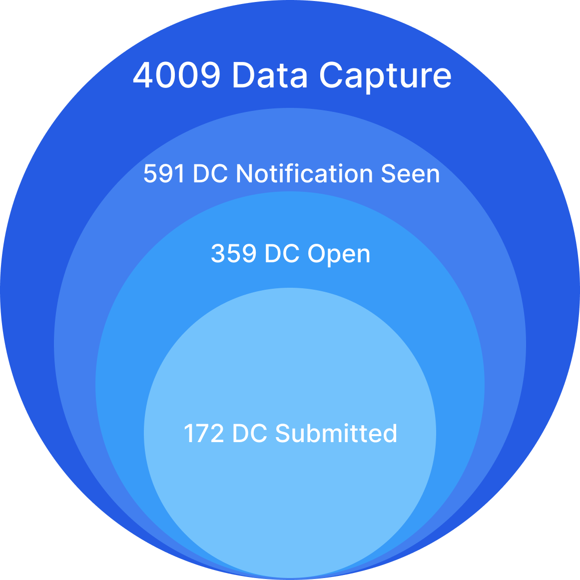
Only 48 % of users who receive the questionnaire complete it.
The multi-step journey overwhelms customers and lacks user-friendliness.
Skipping or ignoring KYC puts accounts in danger of closure.
Enhancements are constrained by KYC’s standalone legacy back-end
Research
What do customers experience?
I conducted a comprehensive audit of the KYC experience, mapping every step from the customer’s perspective. The walkthrough revealed a disjointed, confusing journey that highlights how poorly organized the forms are.

Identifying the pain points
The audit confirmed that the current KYC flow overwhelms customers:
Intrusive entry point — An interstitial blocks access to the dashboard at sign-in, forcing customers into KYC before they can do anything else.
No single home — KYC steps are scattered; there’s no dedicated page that consolidates all KYC tasks.
Off-system UI — Key components aren’t built with Citi’s design system, causing visual and functional inconsistencies.
Endless scrolling — Long, densely worded questions create information overload and make the form feel never-ending.
Understading KYC flow
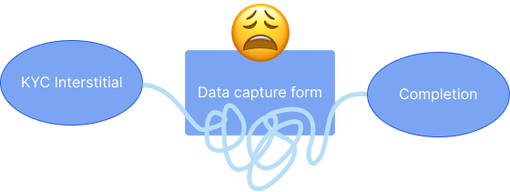
At a high level, the KYC journey boils down to three stages:
KYC Interstitial — a blocking screen that prompts the customer to begin the process.
Data-Capture Form — a dynamic questionnaire that requests documents or additional details, varying by KYC type.
Completion — confirmation once all requirements are met.
Although it looks straightforward on paper, the execution is far more cumbersome for users.
Ideation
Opportunities to improve

KYC is non-negotiable for customers, yet the process feels long and overwhelming. We must turn it into a smooth, step-by-step experience. Key improvement areas:
Landing page — a single hub that explains KYC’s purpose and what’s coming next.
Content organization — break tasks into focused, bite-sized steps with clear, digestible copy.
Landing page
Why not create a place for all things KYC?
KYC isn’t part of day-to-day banking; it’s a multi-form, high-stakes process with its own rules and data requirements. Consolidating every KYC task—forms, status, and guidance—into a dedicated space keeps the main dashboard uncluttered and gives customers a clear, end-to-end path to compliance.
What the Original Interstitial Did
Displayed a legal/business notice that KYC must be completed.
Offered little context or guidance, leaving customers unsure about what would happen next.

What the New KYC Landing Page Should Deliver
State the purpose — a short headline and blurb explain why KYC is required and what users will do.
Show required actions — a simple list of tasks (e.g., “Verify ID,” “Update address”) with clear complete / incomplete labels.
Keep it native — built with Citi’s design system to keep the consistency


User-Testing Insights: Dedicated KYC Landing Page
Participants unanimously welcomed a single hub that summarizes the entire process:
“The landing page feels inviting—much better than a pop-up.”
“I can finally see everything I need to finish.”
“The progress bar tells me exactly how far I have to go.”
However, there are some constraints
Compliance ruled that some data-capture forms must remain separate, so they can’t be merged into one flow.
Because questions branch dynamically based on customer answers, a linear progress bar is no longer feasible.
Content organization
One-Task Flow, Smart Grouping
KYC asks niche, mandatory questions beyond everyday banking.
Show one bite-sized step at a time; cluster related fields (address, employment, income).
Inline tips and definitions cut jargon and speed users through the process.
Key Problems in the Original Forms
Straightforward data requests were wrapped in an unnecessarily complex flow.
KYC-specific jargon appeared without explanations, leaving customers guessing.


Designing Content That Never Overwhelms
One task per screen – break the flow into bite-sized steps with clear, single goals.
Show, don’t overload – use icons and short labels; surface tips only when users hover or tap for help.
Save-and-resume – auto-store progress so customers can pick up exactly where they left off.


User-Testing Insights: One step at a time keeps users focused
Single-task screens with bite-sized copy made the flow faster and calmer for users. They especially appreciated clear icons and a save-and-resume option:
“Icons draw my attention and help process the each option better.”
“I can focus on what I am currently doing, not distracted.”
“Save & Close option lets me know I can come back to this.”
Technical Constraints & Workarounds
Single-page form required — Limited back-end storage forces all tasks to live on one page, even though single-task screens tested best.
No Save & Close — Session-based data means progress can’t be stored between visits, so users must finish in one sitting.
Final Design
Accommodating both user needs & feasibility
🎯 Landing Page
Why we ask — a concise headline and subtext that explain Citi’s regulatory duty to collect KYC information.
What you’ll need — an at-a-glance checklist of each form plus the documents required for completion.


🗂️ Content organization
Accordion layout — only one task is open at a time; expand/collapse keeps the flow focused yet accessible.
Inline review panel — a quick-scan summary with “Edit” links replaces the missing Save-&-Close, so users can revise answers before submitting.
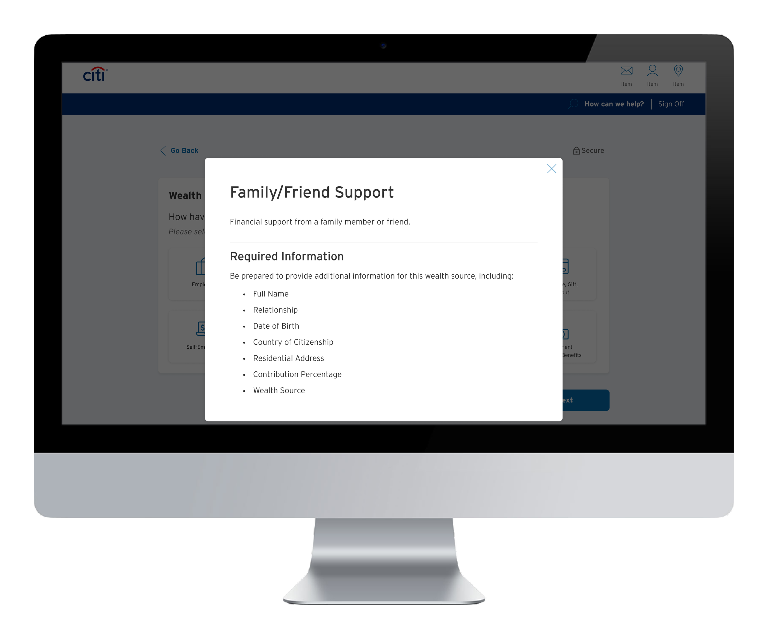
Contextual modals/sheets — tap to reveal definitions or upload tips without leaving the form, keeping guidance right where it’s needed.
Icons (chips for mobile)


Edit feature


Modal (sheet for mobile)

Prototype
End-to-end experience
After multiple sprints with product, engineering, and copy, we integrated every requirement into a clear, step-by-step flow that guides customers smoothly to completion.
😀 Here’s the new end-to-end KYC experience.
Conclusion
Takeaway
The KYC overhaul is rolling out in phases, and the screens shown here represent just one slice of that work. I’m proud to help turn a dense, compliance-driven process into a user-friendly journey—and I’m excited to keep pushing until every KYC flow adopts the new design and a full “Save & Finish Later” option brings even more convenience to customers.