

Role
UX, visual design
Duration
2 Sprints + 3 Sprints for update
Tools
Sketch, Invision, Figma
More secure sign on by QR code
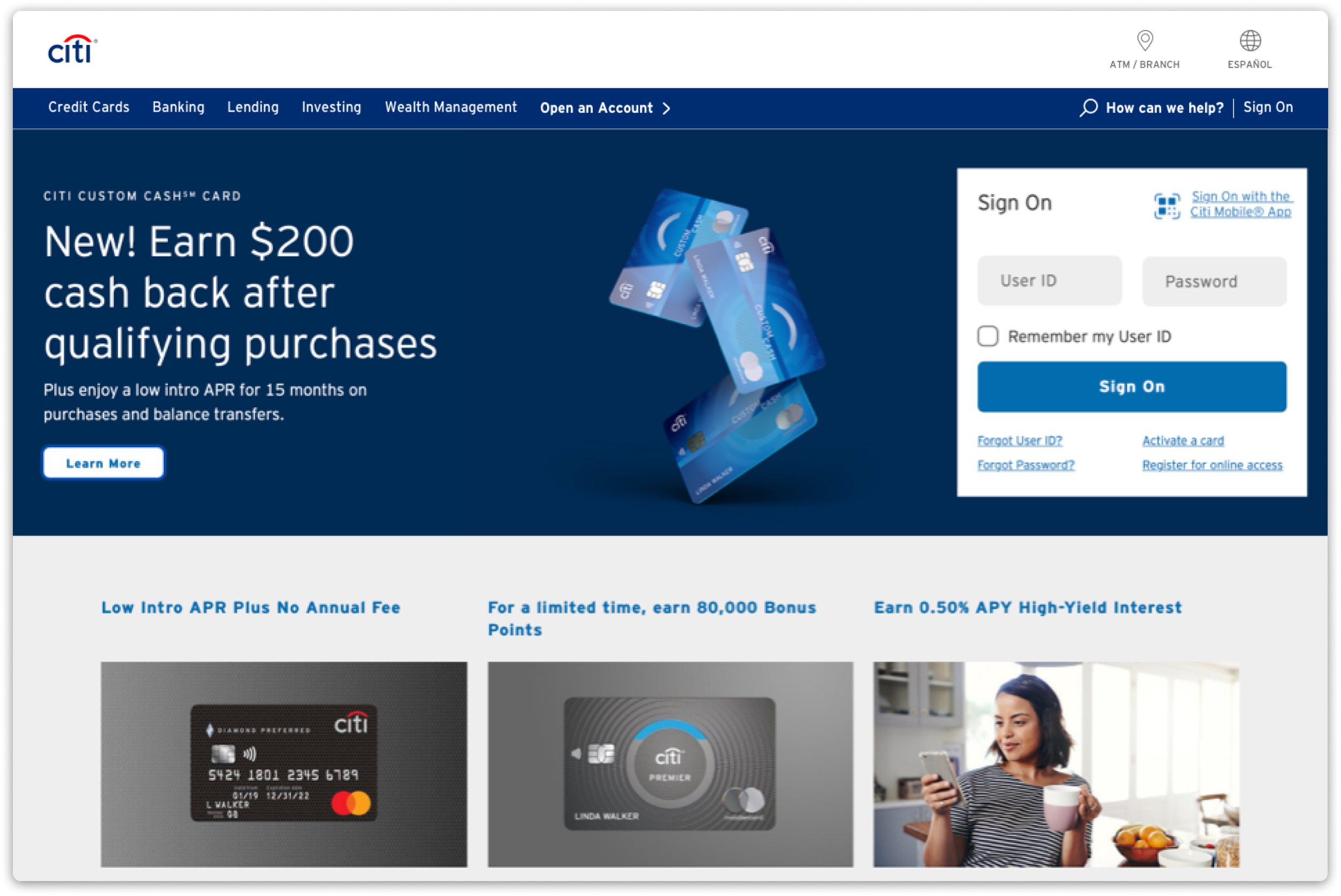
Redesigning homepage sign on box
Summary
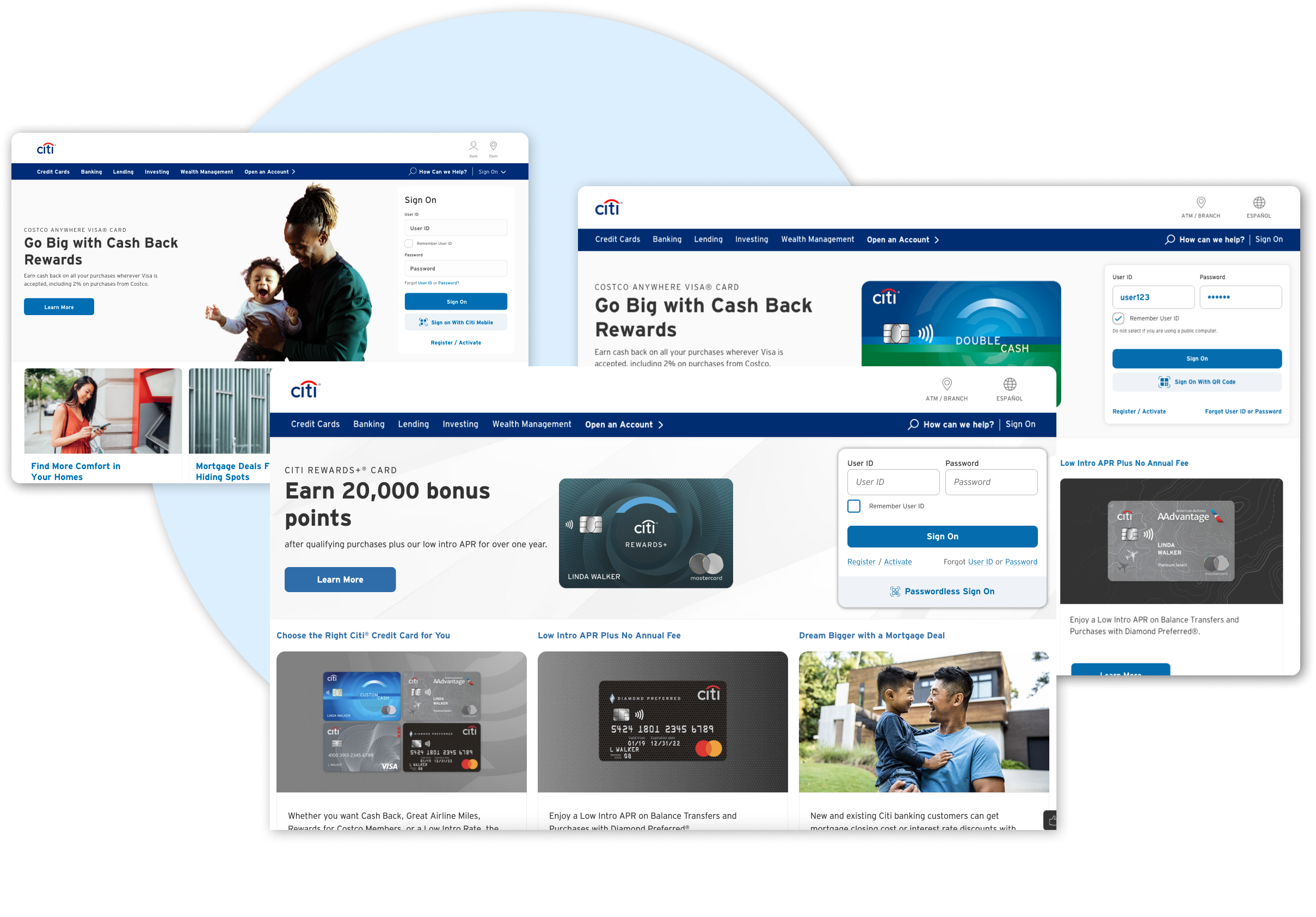
Introducing more secure sign on method, QR code. By redesigning sign on box Citi’s homepage, QR code is a primary option to sign on.
Initial QR code introduction didn’t gain much usage, 1st round of redesign was interfering with the Line of Business content. And, finally in 2023, new sign on box design launched to entice customers to QR code as the primary option to sign on.
New sign-on method at Citi
Citi introduced a QR code sign on as part of the user ID and password sign on. However, the initial introduction of QR code sign on in the original design didn’t catch the customers’ attention as much as Citi anticipated.
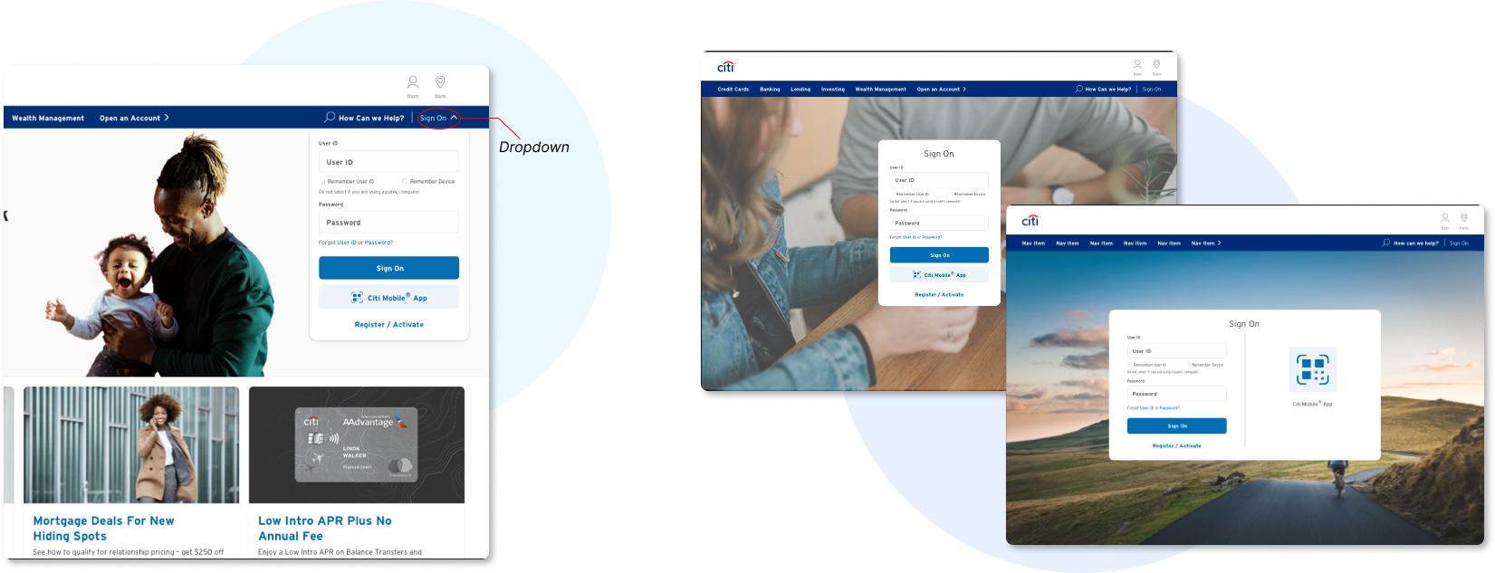
Thus, new sign on box design was introduced by putting more importance on the QR code sign on. The only problem with new sign on box design was that taller height of the box pushes lines of business (LOB) content down on minimum desktop screen size.
Why initial designs didn’t work
First attempt at introducing QR code in the sign-on box
Overall the sign-on box looks outdated
QR code method isn’t prominent enough
Newer sign-on box design
Updated look and feel
QR code as alternative CTA below primary Sign On CTA
Height is too tall to cut line of business content below

What can we do with sign on box then?
Requirement
QR code method with more on priority and height short enough to avoid cutting LOB content.
What about unconventional method of sign on box then?
Show/hide by using dropdown?
Unnecessary extra step to initiate sign on, hinder customers from finding sign on
Populate sign on page? Utilize more space for QR sign on
Sign on doesn’t need the entire page, again it is extra work for sign on
Need to explore new design accommodating dimension and QR code
The visibility of sign on box is more important to attract customers to sign on initially. Signing on is the most important action and entire purpose for this component.
Following design explorations features,
User ID & password input fields side by side
Simpler or more prominent QR code
Mindful of dimension for LOB content

Sign on box with mindful dimension and more apparent QR code method
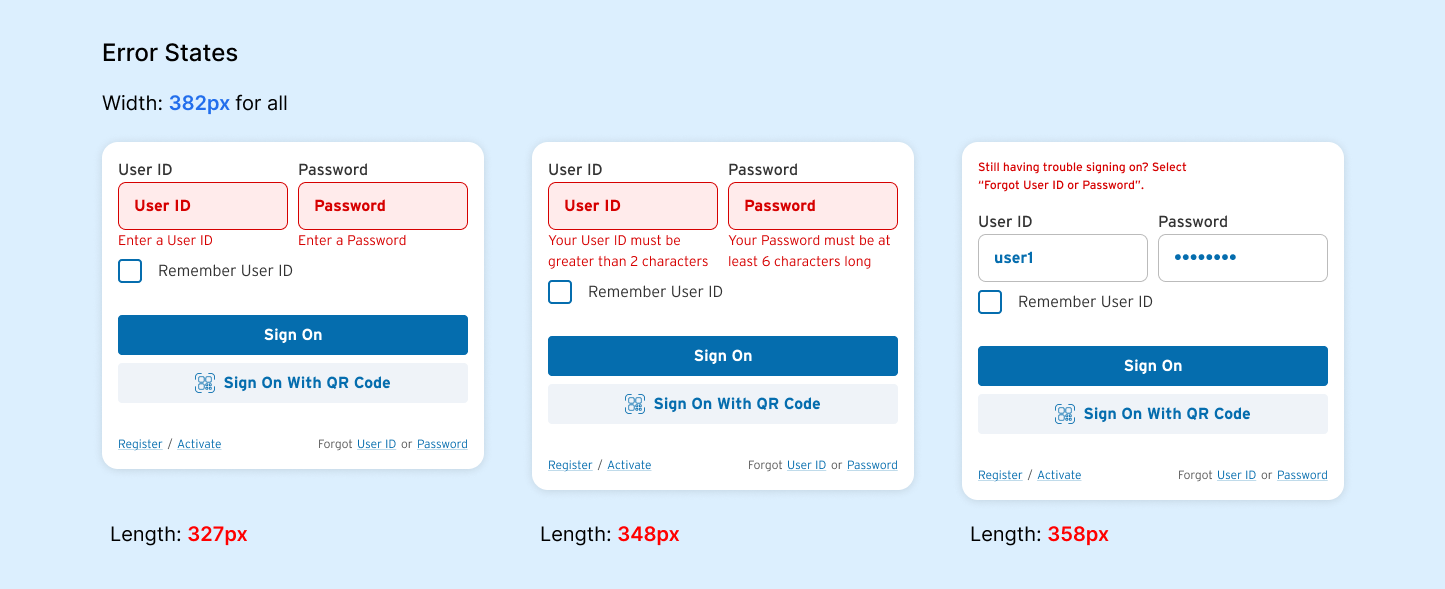
Iterations after iterations led to the right dimension and stress testing to accommodate error states, the new design provided a solution to fit in to homepage and not interfere with LOB content.

The final design has the height of 306px in the default state while fitting QR code method and created a hierarchy in the order of primary action items, the two Sign On CTAs, then Register/Activate & Forgot User ID/Password.
Error states were explored as stress-testing as there are different types of errors, focusing on the errors that cause change in length of the box.
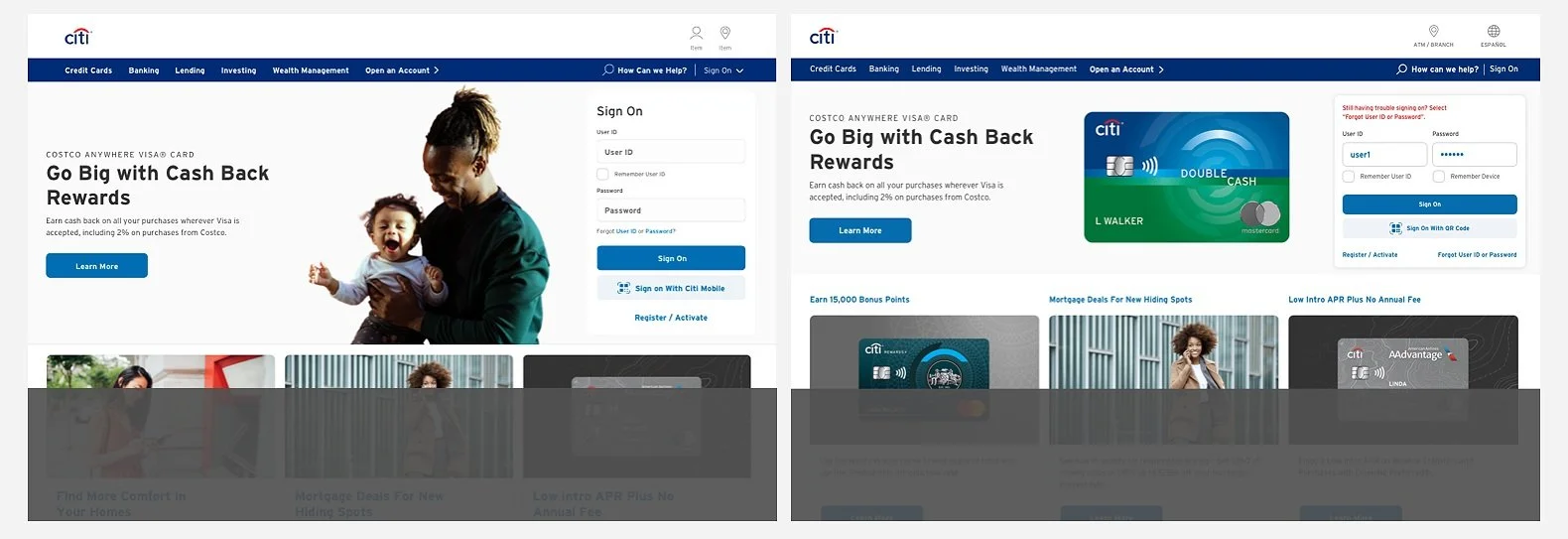
Now here’s a comparison of the initial design and the new design
As mentioned throughout the process, the goal of the new sign on box design was to keep the LOB contents visible to customers on minimum desktop size.
QR code sign on as a default option
After a successful launch of the new sign on box, Citi wanted to pursue QR code as a primary sign on option for customers as QR code is a more secure experience that reduces interdiction & fraud.
The obvious goal is to increase the usage of QR code more than the second redesign that accommodated LOB content.
User Testing 1 - New iteration on Sign On box
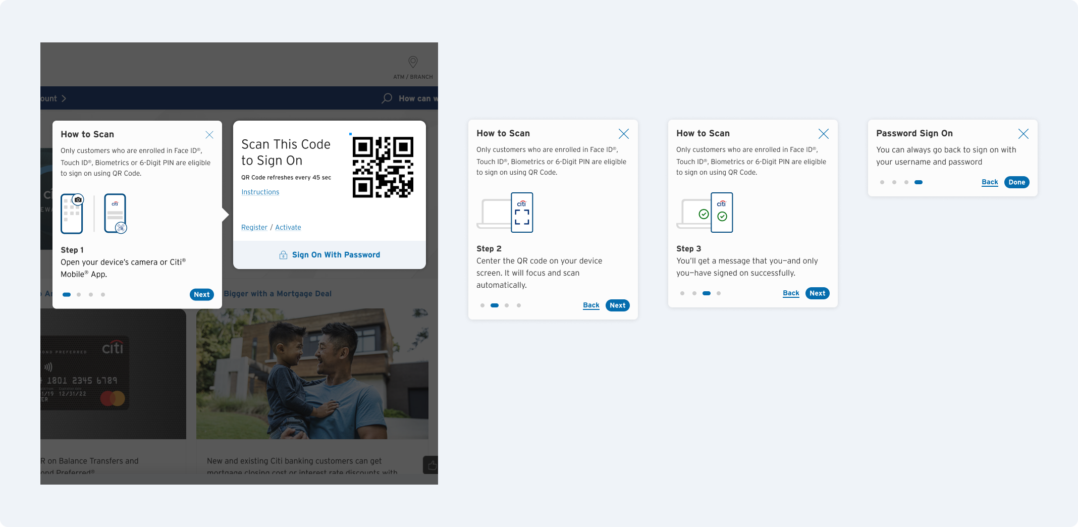
After several iterations, user tested to learn if the change of CTA position will decrease the number of clicks and new copy for CTA, “Passwordless Sign On.”
Resulted 73% of the respondents could notice the CTA easily - close proximity with User ID Sign On option and preferred “Passwordless Sign On” more than “Sign On with QR Code.”

QR Code Instruction
Added QR code instruction to make sure customers understand the process as an effort to emphasize and promote QR code sign on.
User Testing 2 - QR code default Sign On for returning users
QR code sign on well received by respondents, but it was important to see if the returning users would expect QR code was their default option from that point on.
After the first QR use, almost 80% of respondents consider QR code is convenient when returning to the site.

Sign On evolved to more secure way
Signing on to your bank account may not seem like a big deal. What’s so difficult about signing on?
Well, when it comes to banking, it’s important to keep your finances secure. That’s why Citi wants to protect its customers from the very beginning of Citi banking experience.
Conclusion
Entire process of sign on box design provided a new perspective on simple action, signing on to account.
The idea of Sign On is pretty given, it needs user ID, password, and sign on/login CTA to begin with, then there are additional features like “remember user ID,” “forgot user ID/password,” and “register.”
QR code sign on isn’t as common as the typical user ID & password login. So learning to encourage users to use QR code as the most secure way to login was a new experience for me and user testing results were surprisingly positive for unconventional sign on option.